<<Describing Charts and Graphs>>
<Parts of a chart>
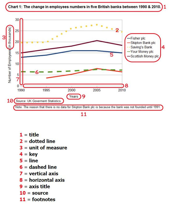

<Vocabulary>

How to begin a description
- Let me show you this bar graph…
- Let’s turn to this diagram…
- I’d like you to look at this map…
- If you look at this graph, you will notice…
- Let’s have a look at this pie chart…
- If you look at this line chart, you will understand…
- To illustrate my point, let’s look at some charts…
How to describe diagrams and other visuals: naming the parts
- The vertical axis shows…
- The horizontal axis represents…
- This curve illustrates…
- The solid line shows…
- The shaded area describes…
- This coloured segment is for…
- The red bar…
Movement (Verbs): Up
- Rose
- Went up
- Increased
- Grew
- Shot up
- Surged
- Rocketed
- Fell
- Declined
- Dropped
- Decreased
- Sank
- Went down
- Plunged
- Plummeted
Prepositions
- Between 1995 and 2000
- From 1995 to 2000
- Sales rose from 200 to 250
- Sales fell to 150 in March
- Sales fell by 50%
Adverbs and intensifiers
- slightly
- a little
- a lot
- sharply
- suddenly
- steeply
- gradually
- gently
- steadily
No Movement: (Verbs with Adjectives, Verbs)
- remained steady
- were unchanged
- did not change
- remained constant
- remained stable
- stabilized
Tops and Bottoms
- reached a peak
- peaked
- reached their highest level
- fell to a low
- sank to a trough
- reached a bottom
<Quizlet>
<Sample Description>

The graph shows the fluctuation in the number of people at a London underground station over the course of a day.
The busiest time of the day is in the morning. There is a sharp increase between 06:00 and 08:00, with 400 people using the station at 8 o’clock. After this the numbers drop quickly to less than 200 at 10 o’clock. Between 11 am and 3 pm the number rises, with a plateau of just under 300 people using the station.
In the afternoon, numbers decline, with less than 100 using the station at 4 pm. There is then a rapid rise to a peak of 380 at 6pm. After 7 pm, numbers fall significantly, with only a slight increase again at 8pm, tailing off after 9 pm.
Overall, the graph shows that the station is most crowded in the early morning and early evening periods.
<Listen to chart descriptions>
https://www.ieltspodcast.com/international-student-enrolment-in-british-universities-2009-2014/
https://www.ieltspodcast.com/bar-chart-on-total-consumption-increase/
https://www.ieltspodcast.com/bar-chart-on-life-expectancy-2006/
https://www.ieltspodcast.com/percent-of-eligible-voters-registered-for-each-race-by-state-and-year/
https://www.ieltspodcast.com/average-weekly-attacks-bar-chart/
https://www.ieltspodcast.com/ielts-academic-task-1-model-answer-1-pet-owners/
https://www.ieltspodcast.com/foreign-direct-investment-in-australia-over-3-years/
https://www.ieltspodcast.com/expected-city-visits-by-country-of-origin-for-2018-thousandsyear/
https://www.ieltspodcast.com/ielts-academic-task-1-sample-essay-28-waste-hauling-truck-trips/
https://www.ieltspodcast.com/ielts-academic-task-1-sample-essay-4-book-sales-by-genre-across-time/
https://www.ieltspodcast.com/ielts-academic-task-1-sample-essay-27unemployment-rate-in-asia/
<eBook>